| Contents | Previous | Next | Programmer's Guide to the JavaTM 2D API |
You can use the Java 2D™ API transformation and drawing mechanisms with text strings. In addition, the Java 2D API provides text-related classes that support fine-grain font control and sophisticated text layout. These include an enhanced Font class and the new TextLayout class.
This chapter focuses on the new font and text layout capabilities supported through interfaces and classes in java.awt, and java.awt.font. For more information about using these features, see the 2D Text Tutorial that’s available through the Java Developer Connection at http://developer.java.sun.com/developer/onlineTraining/Graphics/2DText/.
For information about text analysis and internationalization, refer to the java.text documentation and the “Writing Global Programs” track in the Java Tutorial. For information about using the text layout mechanisms implemented in Swing, see the java.awt.swing.text documentation and “Using the JFC/Swing Packages” in the Java Tutorial.
Note: The information on international text layout contained in this chapter is based on the paper International Text in JDK 1.2 by Mark Davis, Doug Felt, and John Raley, copyright 1997, Taligent, Inc.
The following tables list the key font and text layout interfaces and classes. Most of these interfaces and classes are part of the java.awt.font package. Some, like Font, are part of the java.awt package to maintain backward compatibility with earlier versions of the JDK.
The Font class has been enhanced to support the specification of detailed font information and enable the use of sophisticated typographic features.
A Font object represents an instance of a font face from the collection of font faces available on the system. Examples of common font faces include Helvetica Bold and Courier Bold Italic.
Three names are associated with a Font—its logical name, family name, and font face name:
Font object’s logical name is a name mapped onto one of the specific fonts available on the platform. The logical font name is the name used to specify a Font in JDK 1.1 and earlier releases. When specifying a Font in Java™ 2 SDK, you should use the font face name instead of the logical name.You can get the logical name from the Font by calling getName. To get a list of the logical names that are mapped onto the specific fonts available on a platform, call java.awt.Toolkit.getFontList. Font object’s family name is the name of the font family that determines the typographic design across several faces, such as Helvetica. You retrieve the family name through the getFamily method. Font objects’ font face name refers to an actual font installed on the system. This is the name you should use when specifying a font in Java 2 SDK. It’s often referred to as just the font name. You can retrieve the font name by calling getFontName. To determine which font faces are available on the system, you can call GraphicsEnvironment.getAllFonts.
You can access information about a Font through the getAttributes method. A Font’s attributes include its name, size, transform, and font features such as weight and posture.
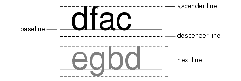
A LineMetrics object encapsulates the measurement information associated with a Font, such as its ascent, descent, and leading:
This information is used to properly position characters along a line, and to position lines relative to one another. You can access these line metrics through the getAscent, getDescent, and getLeading methods. You can also access information about a Font’s height, baseline, and underline and strikethrough characteristics through LineMetrics.
Before a piece of text can be displayed, it must be properly shaped and positioned using the appropriate glyphs and ligatures. This process is referred to as text layout. The text layout process involves:
The information used to lay out text is also necessary for performing text operations such as caret positioning, hit detection, and highlighting.
To develop software that can be deployed in international markets, text must be laid out in different languages in a way that conforms to the rules of the appropriate writing system.
A glyph is the visual representation of one or more characters. The shape, size, and position of a glyph is dependent on its context. Many different glyphs can be used to represent a single character or combination of characters, depending on the font and style.
For example, in handwritten cursive text, a particular character can take on different shapes depending on how it is connected to adjacent characters.
In some writing systems, particularly Arabic, the context of a glyph must always be taken into account. Unlike in English, cursive forms are mandatory in Arabic; it is unacceptable to present text without using cursive forms.
Depending on the context, these cursive forms can differ radically in shape. For example, the Arabic letter heh has the four cursive forms shown in Figure 4-2.
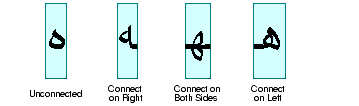
Although these four forms are quite different from one another, such cursive shape-changing is not fundamentally different from cursive writing in English.
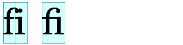
In some contexts, two glyphs can change shape even more radically and merge to form a single glyph. This type of merged glyph is called a ligature. For example, most English fonts contain the ligature fi shown in Figure 4-3. The merged glyph takes into account the overhang on the letter f and combines the characters in a natural-looking way, instead of simply letting the letters collide.
Ligatures are also used in Arabic and the use of some ligatures is mandatory—it is unacceptable to present certain character combinations without using the appropriate ligature. When ligatures are formed from Arabic characters, the shapes change even more radically than they do in English. For example, Figure 4-4 illustrates how two Arabic characters are combined into a single ligature when they appear together.
In the Java™ programming language, text is encoded using Unicode character encoding. Text that uses Unicode character encoding is stored in memory in logical order. Logical order is the order in which characters and words are read and written. The logical order is not necessarily the same as the visual order, the order in which the corresponding glyphs are displayed.
The visual order for glyphs in a particular writing system (script) is called the script order. For example, the script order for Roman text is left-to-right and the script order for Arabic and Hebrew is right-to-left.
Some writing systems have rules in addition to script order for arranging glyphs and words on lines of text. For example, Arabic and Hebrew numbers run left to right, even though the letters run right to left. (This means that Arabic and Hebrew, even with no embedded English text, are truly bidirectional.)
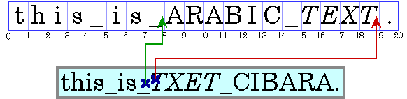
A writing system’s visual order must be maintained even when languages are mixed together. This is illustrated in Figure 4-5, which displays an Arabic phrase embedded in an English sentence.
Note: In this and subsequent examples, Arabic and Hebrew text is represented by uppercase letters and spaces are represented by underscores. Each illustration contains two parts: a representation of the characters stored in memory (the characters in logical order) followed by a representation of how those characters are displayed (the characters in visual order). The numbers below the character boxes indicate the insertion offsets.
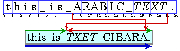
Even though they are part of an English sentence, the Arabic words are displayed in the Arabic script order, right-to-left. Because the italicized Arabic word is logically after the Arabic in plain text, it is visually to the left of the plain text.
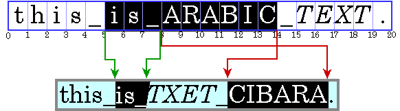
When a line with a mixture of left-to-right and right-to-left text is displayed, the base direction is significant. The base direction is the script order of the predominant writing system. For example, if the text is primarily English with some embedded Arabic, then the base direction is left-to-right. If the text is primarily Arabic with some embedded English or numbers, then the base direction is right-to-left.
The base direction determines the order in which segments of text with a common direction are displayed. In the example shown in Figure 4-5, the base direction is left-to-right. There are three directional runs in this example: the English text at the beginning of the sentence runs left to right, the Arabic text runs right to left, and the period runs left to right.
Graphics are often embedded in the flow of text. These inline graphics behave like glyphs in terms of how they affect the text flow and line wrapping. Such inline graphics need to be positioned using the same bidirectional layout algorithm so that they appear in the proper location in the flow of characters.
For more information about the precise algorithm used to order glyphs within a line, see the description of the Bidirectional Algorithm in The Unicode Standard, Version 2.0, Section 3.11.
Unless you are working with a monospace font, different characters in a font have different widths. This means that all positioning and measuring of text has to take into account exactly which characters are used, not just how many. For example, to right-align a column of numbers displayed in a proportional font, you can’t simply use extra spaces to position the text. To properly align the column, you need to know the exact width of each number so that you can adjust accordingly.
Text is often displayed using multiple fonts and styles, such as bold or italic. In this case, even the same character can have different shapes and widths, depending on how it is styled. To properly position, measure, and render text, you need to keep track of each individual character and the style applied to that character. Fortunately, TextLayout does this for you.
To properly display text in languages such as Hebrew and Arabic, each individual character needs to be measured and positioned within the context of neighboring characters. Because the shapes and positions of the characters can change depending on the context, measuring and positioning such text without taking the context into account produces unacceptable results.
To allow the user to edit the text that is displayed, you must be able to:
In editable text, a caret is used to graphically represent the current insertion point, the position in the text where new characters will be inserted. Typically, a caret is shown as a blinking vertical bar between two glyphs. New characters are inserted and displayed at the caret's location.
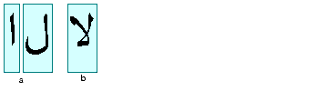
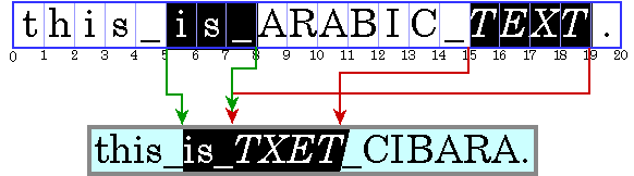
Calculating the caret position can be complicated, particularly for bidirectional text. Insertion offsets on directional boundaries have two possible caret positions because the two glyphs that correspond to the character offset are not displayed adjacent to one another. This is illustrated in Figure 4-6. In this figure, the carets are shown as square brackets to indicate the glyph to which the caret corresponds.
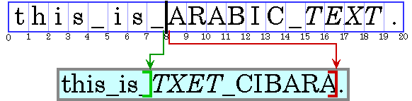
Character offset 8 corresponds to the location after the _ and before the A. If the user enters an Arabic character, its glyph is displayed to the right of (before) the A; if the user enters an English character, its glyph is displayed to the right of (after) the _.
To handle this situation, some systems display dual carets, a strong (primary) caret and a weak (secondary) caret. The strong caret indicates where an inserted character will be displayed when that character's direction is the same as the base direction of the text. The weak caret shows where an inserted character will be displayed when the character's direction is the opposite of the base direction. TextLayout automatically supports dual carets; JTextComponent does not.
When you’re working with bidirectional text, you can’t simply add the widths of the glyphs before a character offset to calculate the caret position. If you did, the caret would be drawn in the wrong place, as shown in Figure 4-7.
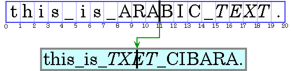
For the caret to be properly positioned, the widths of the glyphs to the left of the offset need to be added and the current context taken into account. Unless the context is taken into account, the glyph metrics won’t necessarily match the display. (The context can affect which glyphs are used.)
All text editors allow the user to move the caret with the arrow keys. Users expect the caret to move in the direction of the pressed arrow key. In left-to-right text, moving the insertion offset is simple: the right arrow key increases the insertion offset by one and the left arrow key decreases it by one. In bidirectional text or in text with ligatures, this behavior would cause the caret to jump across glyphs at direction boundaries and move in the reverse direction within different directional runs.
To move the caret smoothly through bidirectional text, you need to take into account the direction of the text runs. You can’t simply increment the insertion offset when the right arrow key is pressed and decrement it when the left arrow key is pressed. If the current insertion offset is within a run of right-to-left characters, the right arrow key should decrease the insertion offset, and the left arrow key should increase it.
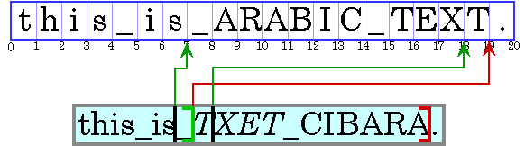
Moving the caret across a directional boundary is even more complicated. Figure 4-8 illustrates what happens when a directional boundary is crossed when the user is navigating with the arrow key. Stepping three positions to the right in the displayed text corresponds to moving to the character offsets 7, 19, then 18.
Certain glyphs should never have a caret between them; instead, the caret should move as though the glyphs represented a single character. For example, there should never be a caret between an o and an umlaut if they are represented by two separate characters. (See The Unicode Standard, Version 2.0, Chapter 5, for more information.)
TextLayout provides methods (getNextRightHit and getNextLeftHit) that enable you to easily move the caret smoothly through bidirectional text.
Often, a location in device space must be converted to a text offset. For example, when a user clicks the mouse on selectable text, the location of the mouse is converted to a text offset and used as one end of the selection range. Logically, this is the inverse of positioning a caret.
When you’re working with bidirectional text, a single visual location in the display can correspond to two different offsets in the source text, as shown in Figure 4-9.
Because a single visual location can correspond to two different offsets, hit testing bidirectional text isn’t just a matter of measuring glyph widths until the glyph at the correct location is found and then mapping that position back to a character offset. Detecting the side that the hit was on helps distinguish between the two alternatives.
You can perform hit testing using TextLayout.hitTestChar. Hit information is encapsulated in a TextHitInfo object and includes information about the side that the hit was on.
A selected range of characters is represented graphically by a highlight region, an area in which glyphs are displayed with inverse video or against a different background color.
Highlight regions, like carets, are more complicated for bidirectional text than for monodirectional text. In bidirectional text, a contiguous range of characters might not have a contiguous highlight region when displayed. Conversely, a highlight region showing a visually contiguous range of glyphs might not correspond to a single, contiguous range of characters.
This results in two strategies for highlighting selections in bidirectional text:
Logical highlighting is simpler to implement, since the selected characters are always contiguous in the text.
Depending on which Java™ APIs you use, you can have as little or as much control over text layout as you need:
JTextComponent, which will perform the text layout for you. JTextComponent is designed to handle the needs of most international applications and supports bidirectional text For more information about JTextComponent, see “Using the JFC/Swing Packages” in the Java Tutorial.Graphics2D.drawString and let Java 2D™ lay out the string for you. You can also use drawString to render styled strings and strings that contain bidirectional text. For more information about rendering text through Graphics2D, see “Rendering Graphics Primitives” on page 37.TextLayout to manage text layout, highlighting, and hit detection. The facilities provided by TextLayout handle most common cases, including text strings with mixed fonts, mixed languages, and bidirectional text. For more information about using TextLayout, see “Managing Text Layout” on page 58.GlyphVectors using Font and then render them through Graphics2D. For more information about implementing your own text layout mechanism, see “Implementing a Custom Text Layout Mechanism” on page 64.
Generally, you do not need to perform text layout operations yourself. For most applications, JTextComponent is the best solution for displaying static and editable text. However, JTextComponent does not support the display of dual carets or discontiguous selections in bidirectional text. If your application requires these features, or you prefer to implement your own text editing routines, you can use the Java 2D text layout APIs.
The TextLayout class supports text that contains multiple styles and characters from different writing systems, including Arabic and Hebrew. (Arabic and Hebrew are particularly difficult to display because you must reshape and reorder the text to achieve an acceptable representation.)
TextLayout simplifies the process of displaying and measuring text even if you are working with English-only text. By using TextLayout, you can achieve high-quality typography with no extra effort.
The TextLayout class manages the positioning and ordering of glyphs for you. You can use TextLayout to:
In some situations, you might want to compute the text layout yourself, so that you can control exactly which glyphs are used and where they are placed. Using information such as glyph sizes, kerning tables, and ligature information, you can construct your own algorithms for computing the text layout, bypassing the system’s layout mechanism. For more information, see “Implementing a Custom Text Layout Mechanism” on page 64.
TextLayout automatically lays out text, including bidirectional (BIDI) text, with the correct shaping and ordering. To correctly shape and order the glyphs representing a line of text, TextLayout must know the full context of the text:
TextLayout directly from the text. TextLayout directly. You must use a LineBreakMeasurer to provide sufficient context.
The base direction of the text is normally set by an attribute (style) on the text. If that attribute is missing, TextLayout follows the Unicode bidirectional algorithm and derives the base direction from the initial characters in the paragraph.
TextLayout maintains caret information such as the caret Shape, position, and angle. You can use this information to easily display carets in both monodirectional and bidirectional text. When you’re drawing carets for bidirectional text, using TextLayout ensures that the carets will be positioned correctly.
TextLayout provides default caret Shapes and automatically supports dual carets. For italic and oblique glyphs, TextLayout produces angled carets, as shown in Figure 4-12. These caret positions are also used as the boundaries between glyphs for highlighting and hit testing, which helps produce a consistent user experience.

Given an insertion offset, the getCaretShapes method returns a two-element array of Shapes: element 0 contains the strong caret and element 1 contains the weak caret, if one exists. To display dual carets, you simply draw both caret Shapes; the carets will be automatically be rendered in the correct positions.
If you want to use custom caret Shapes, you can retrieve the position and angle of the carets from the TextLayout and draw them yourself.
In the following example, the default strong and weak caret Shapes are drawn in different colors. This is a common way to differentiate dual carets.
Shape[] caretShapes = layout.getCaretShapes(hit);
g2.setColor(PRIMARY_CARET_COLOR);
g2.draw(caretShapes[0]);
if (caretShapes[1] != null){
  g2.setColor(SECONDARY_CARET_COLOR);
  g2.draw(caretShapes[1]);
}
You can also use TextLayout to determine the resulting insertion offset when a user presses the left or right arrow key. Given a TextHitInfo object that represents the current insertion offset, the getNextRightHit method returns a TextHitInfo object that represents the correct insertion offset if the right arrow key is pressed. The getNextLeftHit method provides the same information for the left arrow key.
In the following example, the current insertion offset is moved in response to a right arrow key.
TextHitInfo newInsertionOffset =             layout.getNextRightHit(insertionOffset);
if (newInsertionOffset != null) {
  Shape[] caretShapes =
          layout.getCaretShapes(newInsertionOffset);
  // draw carets
  ...
  insertionOffset = newInsertionOffset;
}
TextLayout provides a simple mechanism for hit testing text. The hitTestChar method takes x and y coordinates from the mouse as arguments and returns a TextHitInfo object. The TextHitInfo contains the insertion offset for the specified position and the side that the hit was on. The insertion offset is the offset closest to the hit: if the hit is past the end of the line, the offset at the end of the line is returned.
In the following example, hitTestChar is called on a TextLayout and then getInsertIndex is used to retrieve the offset.
You can get a Shape that represents the highlight region from the TextLayout. TextLayout automatically takes the context into account when calculating the dimensions of the highlight region. TextLayout supports both logical and visual highlighting.
In the following example, the highlight region is filled with the highlight color and then the TextLayout is drawn over the filled region. This is one simple way to display highlighted text.
Shape highlightRegion = layout.getLogicalHighlightShape(hit1,      hit2);
graphics.setColor(HIGHLIGHT_COLOR);
graphics.fill(highlightRegion);
graphics.drawString(layout, 0, 0);
TextLayout provides access to graphical metrics for the entire range of text it represents. Metrics available from TextLayout include the ascent, descent, leading, advance, visible advance, and the bounding rectangle.
More than one Font can be associated with a TextLayout: different style runs can use different fonts. The ascent and descent values for a TextLayout are the maximum values of all of the fonts used in the TextLayout. The computation of the TextLayout's leading is more complicated; it’s not just the maximum leading value.
The advance of a TextLayout is its length: the distance from the left edge of the leftmost glyph to the right edge of the rightmost glyph. The advance is sometimes referred to as the total advance. The visible advance is the length of the TextLayout without its trailing whitespace.
The bounding box of a TextLayout encloses all of the text in the layout. It includes all the visible glyphs and the caret boundaries. (Some of these might hang over the origin or origin + advance). The bounding box is relative to the origin of the TextLayout, not to any particular screen position.
In the following example, the text in a TextLayout is drawn within the layout’s bounding box.
graphics.drawString(layout, 0, 0);
Rectangle2D bounds = layout.getBounds();
graphics.drawRect(bounds.getX()-1, bounds.getY()-1,
         bounds.getWidth()+2, bounds.getHeight()+2);
TextLayout can also be used to display a piece of text that spans multiple lines. For example, you might take a paragraph of text, line-wrap the text to a certain width, and display the paragraph as multiple lines of text.
To do this, you do not directly create the TextLayouts that represent each line of text—LineBreakMeasurer generates them for you. Bidirectional ordering cannot always be performed correctly unless all of the text in a paragraph is available. LineBreakMeasurer encapsulates enough information about the context to produce correct TextLayouts.
When text is displayed across multiple lines, the length of the lines is usually determined by the width of the display area. Line breaking (line wrapping) is the process of determining where lines begin and end, given a graphical width in which the lines must fit.
The most common strategy is to place as many words on each line as will fit. This strategy is implemented in LineBreakMeasurer. Other more complex line break strategies use hyphenation, or attempt to minimize the differences in line length within paragraphs. The Java 2D™ API does not provide implementations of these strategies.
To break a paragraph of text into lines, you construct a LineBreakMeasurer with the entire paragraph and then call nextLayout to step through the text and generate TextLayouts for each line.
To do this, LineBreakMeasurer maintains an offset within the text. Initially, the offset is at the beginning of the text. Each call to nextLayout moves the offset by the character count of the TextLayout that was created. When this offset reaches the end of the text, nextLayout returns null.
The visible advance of each TextLayout that the LineBreakMeasurer creates doesn’t exceed the specified line width. By varying the width you specify when you call nextLayout, you can break text to fit complicated areas, such as an HTML page with images in fixed positions or tab-stop fields. You can also pass in a BreakIterator to tell LineBreakMeasurer where valid breakpoints are; if you don't supply one the BreakIterator for the default locale is used.
In the following example, a bilingual text segment is drawn line by line. The lines are aligned to either to the left margin or right margin, depending on whether the base text direction is left-to-right or right-to-left.
Point2D pen = initialPosition;
LineBreakMeasurer measurer = new LineBreakMeasurer(styledText, myBreakIterator);
while (true) {
  TextLayout layout = measurer.nextLayout(wrappingWidth);
  if (layout == null) break;
    pen.y += layout.getAscent();
    float dx = 0;
    if (layout.isLeftToRight())
      dx = wrappingWidth - layout.getAdvance();
    layout.draw(graphics, pen.x + dx, pen.y);
    pen.y += layout.getDescent() + layout.getLeading();
}
The GlyphVector class provides a way to display the results of custom layout mechanisms. A GlyphVector object can be thought of as the output of an algorithm that takes a string and computes exactly how the string should be displayed. The system has a built-in algorithm and the Java 2D™ API lets advanced clients define their own algorithms.
A GlyphVector object is basically an array of glyphs and glyph locations. Glyphs are used instead of characters to provide total control over layout characteristics such as kerning and ligatures. For example, when displaying the string “final”, you might want to replace the leading fi substring with the ligature fi. In this case, the GlyphVector object will have fewer glyphs than the number of characters in the original string.
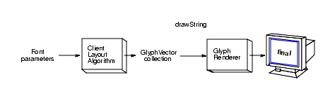
Figure 4-13 and Figure 4-14 illustrate how GlyphVector objects are used by layout mechanisms. Figure 4-13 shows the default layout mechanism. When drawString is called on a String, the built-in layout algorithm:
Font in the Graphics2D context to determine which glyphs to use.GlyphVector.GlyphVector to a glyph rendering routine that does the actual drawing.
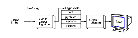
Figure 4-14 shows the process for using a custom layout algorithm. To use a custom layout algorithm, you must assemble all of the information necessary to lay out the text. The basic process is the same:
Font, determine which glyphs to use GlyphVector
To render the text, you pass the GlyphVector to drawString, which in turn passes it to the glyph renderer. In Figure 4-14, the custom layout algorithm replaces the fi substring with the ligature fi.
Using the Font.deriveFont methods, you can create a new Font object with different attributes from an existing Font object. Often, a transform is applied to the existing Font to create a new derived Font. To do this, you:
Font object., AffineTransform you want to apply to the Font. Font.deriveFont, passing in the AffineTransform.
In this way, you could easily create a Font in a custom size or a skewed version of an existing Font.
In the following code excerpt, an AffineTransform is applied to create a skewed version of the font Helvetica. The new derived font is then used to render a string.
	// Create a transformation for the font.
AffineTransform fontAT = new AffineTransform();
fontAT.setToShear(-1.2, 0.0);
// Create a Font Object.
Font theFont = new Font("Helvetica", Font.PLAIN, 1);
// Derive a new font using the shear transform
theDerivedFont = theFont.deriveFont(fontAT);
// Add the derived font to the Graphics2D context
g2.setFont(theDerivedFont);
// Render a string using the derived font
g2.drawString(“Java”, 0.0f, 0.0f);
| Contents | Previous | Next |
Programmer's Guide to the JavaTM 2D API JavaTM 2 SDK, Standard Edition, 1.4 version |
Copyright © 2003 Sun Microsystems, Inc. All rights reserved.